a peek inside the fishbowl

21 Sep, 2012

Reno post #41 – counter conundrum

Posted by andrea tomkins in: Home/reno

Our custom kitchen is *this close* to being installed. We’re only a few days away from delivery, at which point installation will take a few days. The counters come after that. I cannot wait to see it all in place, so much time and thought has gone into planning this space.

Mark and I picked the colours this past week. We were sent to Randall’s (GREAT store by the way) to choose a white from the Pratt & Lambert palette. In the end we came home with a headache and this. Turns out that staring at 50 Shades of White is enough to make your eyeballs peel!

After a significant amount of backing and forthing and hmming and hawing we finally chose a white named “Swiss Coffee,” which, if you judged it by name alone you would assume is a creamy cup of chai, but it is actually white. Sort of. It’s a soft white with a tiny smidgeon of hazel-fawn-caramel. (SEE. HEAD. ACHE.) I saw a proper sample of it yesterday and am very happy with it.

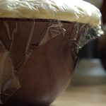
Bob the kitchen guy also mocked up a sample of an espresso-ebony-chestnut for our island, which will have cabinetry that is the same profile as the rest of the kitchen (a modified shaker style I chose based on a reader’s comment on a past post). All of the counters – along the counters and on the island – will be a dark granite that has flecks of brown and streaks of snow-coloured crystal.

So here’s my current worry: the white kitchen cabinet style will also be used in the 2-piece bathroom off the mudroom AND the family bathroom upstairs where we’ll have a small double vanity. NOW we need to pick out a colour for the upstairs bathroom counter. Here’s what I’m looking at (Bob loaned us his Formica samples):

formica-samples

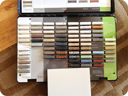
The white board in the photo above is the colour of our cabinetry, the white-that’s-not-really-white a.k.a. SWISS COFFEE.

Bob is casting a vote for something dark like the floors (they are grey). There are white subway tiles in the vicinity. The trim is white, the walls will be grey. I have wanted very light counters to balance all this grey, but now I am looking at this blue and I thinking … wow, that could be a really cool hit of colour.

formica-samples2

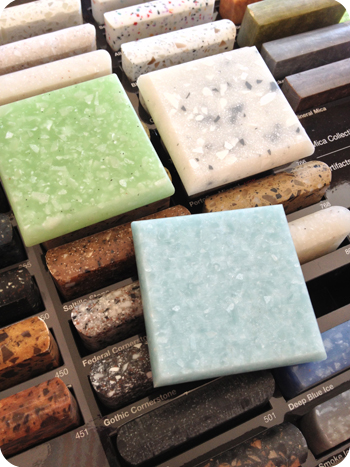
What do you think? The grey-speckled white is cool too…

Tags: , ,

14 Responses to "Reno post #41 – counter conundrum"

1 | marci

September 21st, 2012 at 8:05 am

Avatar

Is it weird that I have a *thing* for countertops? I like all of them, but really – I adore that green one! It’s a gentle pop of fresh unexpected colour! Can’t wait to see how it all turns out!

2 | Giulia

September 21st, 2012 at 9:52 am

Avatar

I like all of them, but just be sure that you’ll like the pop of colour 10 years from now. Countertops are something you most likely won’t change easily, so you’ll have to love much longer than a bright fun blue wall.
I still vividly remember my parents choosing avocado coloured bathroom sinks for the pop of colour…mhhhh.

3 | wendy

September 21st, 2012 at 11:03 am

Avatar

The Blue is very nice, love blue!

4 | Judy

September 21st, 2012 at 12:21 pm

Avatar

The blue is nice but there is a stronger chance of you getting tired of it or it dating itself and you can’t change it as easily as say accessories or wall colours.

5 | Carly

September 21st, 2012 at 1:02 pm

Avatar

I like the coloured countertops, either the green or the blue (the green seems fun “for now” but the blue feels like it may be longer lasting).

But, there is something to be said for going simple and classic with fixtures that aren’t cheap or easy to change.

That said, I did do our entire bathroom, save the separate shower stall in a mosaic glass tiles in blues and greys. It’s a very strong statement, but I LOVE IT! Since we have no plans to move for the next 10+ years, I felt very comfortable going with stronger colours in something kind of permanent.

So . . . if it was my bathroom, I’d go for the pop of colour. Just don’t paint the walls green – it’s very unflattering on most people’s skin tones, making make-up application a challenge. :)

6 | Stefania

September 21st, 2012 at 4:15 pm

Avatar

The blue and the green are both very pretty, but I I would go with something that has lasting power. I’m going to be boring and go with the tile that’s behind the grey and white that you like. It has flecks of various colours.

7 | Sara

September 21st, 2012 at 7:49 pm

Avatar

Grey speckled because it will hide tooth paste marks the best!

8 | Leah

September 21st, 2012 at 7:59 pm

Avatar

Another contrarian ;) I’d go with a counter that has both white and grey in it. Maybe the Gothic Cornerstone (or similar). Then, pick either a bright blue or bright green for accessories: art, towels, soaps, and other pretty things. Actually, a rust orange would be nice for accessories too.

9 | Mary @ Parenthood

September 23rd, 2012 at 7:29 am

Avatar

Assuming they haven’t changed the formula (big assumption actually since it’s been a couple of years), but we painted our bathroom Swiss Coffee too. Love that colour!

We did a fairly light grey & beige counter top but were trying to tie into existing fixtures (grey tub!) and floor (installed by my lovely mother-in-law two decades earlier…). My one regret was that it has small (subtle) flecks of colour that means some towel colours are just no good. So consider the colours of towels you have and/or might like to have in the distant future.

That said, I like the blue. I agree it’s more likely to date than something more neutral but not sure dark grey counts – that sounds just as likely to date in my opinion! (I think the dark counters feel more modern) Personally I’d go with something light for a counter top because I like my bathrooms to feel open and clean. Dark everything gives me the opposite impression.

10 | Stefania

September 24th, 2012 at 9:01 am

Avatar

Mary @ Parenthood: Swiss Coffee? I know so many people who used that paint colour. Very nice.

11 | andrea

September 24th, 2012 at 9:57 am

Avatar

Thanks for all of your thoughts everyone. I agree that this is not the time to go crazy with colour. We’re already doing that in other places, like, er, the front entryway. :)

We are now considering this kind of counter, although it’s not my fave of the bunch. (Mark likes it and I need to give in every once in awhile. I secretly think he likes it because it looks like nougat.) :)

12 | laurel

September 24th, 2012 at 1:18 pm

Avatar

grey blue or blue grey
grey will grow and age with anything along the way!

13 | Stefania

September 24th, 2012 at 2:05 pm

Avatar

A very good choice.

14 | andrea

October 2nd, 2012 at 2:00 pm

Avatar

Can you believe that we, er, I, finally chose our counter material (in the photo, upper right corner) and it’s on backorder? If we wanted that one we’d have to wait until November 15. We have to choose a different one. Bah!

comment form:

Archives

Me and my pet projects

Ottawa Bucket list

Subscribe via email

Enter your email address to subscribe to this blog and receive notifications of new posts by email.


  • Jenn Jilks: That is really exciting! Break a leg!
  • fun88: I was excited to discover this page. I want to to thank you for your time for this fantastic read!! I definitely liked every part of it and i also
  • Gretchen Humphrey: I had a beautiful bee& birdbath filled with a solar fountain and dozens of antique marbles that were suddenly disappearing. At first I thought my
  • Jinjer: I am sobbing reading this post. And you're right, companion is not enough. Little furry treasured gifts that they are. Thanks for sharing cutie-pi
  • Karen: Dear Andrea, Mark and your daughters I am so very sad for your family xxx Piper was/is my favourite Instagram post. You shared with us so intimately
  • Christina Banuelos: Thank you for sharing Pipers life with us. Your posts of Piper brought me joy. Every time I see your post and see what kind of mischief Piper was gett
  • Carla Slocum: I am sitting here yet again crying at your loss. We have known that loss with Asta the WFT our first pup but now have the enormous gift of Stryker the

The Obligatory Blurb

My name is Andrea and I live in the Westboro area of Ottawa with my husband Mark and our dog Piper who is kind of a big deal on Instagram. We also have two human offspring: Emma (24) and Sarah (22). During the day I work as a writer at the Royal Ottawa Mental Health Centre. I am a longtime Ottawa blogger and I've occupied this little corner of the WWW since 1999. The Fishbowl is my whiteboard, water cooler, and journal, all rolled into one. I'm passionate about healthy living, arts and culture, travel, great gear, good food, and sharing the best of Ottawa. I also love vegetables, photography, gadgets, and great design.

If you'd like to contact me, please use this form. If you're so inclined, you can read more about me here. Thank you for visiting!


Connect with me at these places too!

Still calling it Twitter