I’m finally able to reveal all. BWA HA HA. Finally.
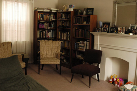
So let’s begin, shall we? Here’s what it looked like before:
And this is what it looks like now:
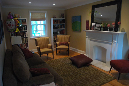
Pretty awesome, isn’t it? We love it. My mother-in-law loves it (and THAT, my friends, is saying a lot) and the handful of people who have seen it love it too.
I haven’t seen the final Citizen article. I don’t know what photos they’re going to show, but the ones that are being published with the article were specially set up and prepped by the designers. I have to come clean. Since then, we have put some of our things back in. We needed to, otherwise the room wouldn’t feel like our own. You know what I mean?
It’s still a work in progress, but one of the things we did was rearrange the bookshelves. They had been very artfully arranged but it wasn’t going to work for us. Atwood couldn’t live beside Grimm’s Fairy Tales (or could she?) and the Harry Potters had to go beside the Lemony Snickets. There are books that we refer to on a regular basis, and others that provide us with comfort just by being there. Our books are part of who we are!
They had to really convince us to get that clown balloon. They said it added a real “cirque” flair to the overall esthetic but I’m not so sure about it. (Kidding)
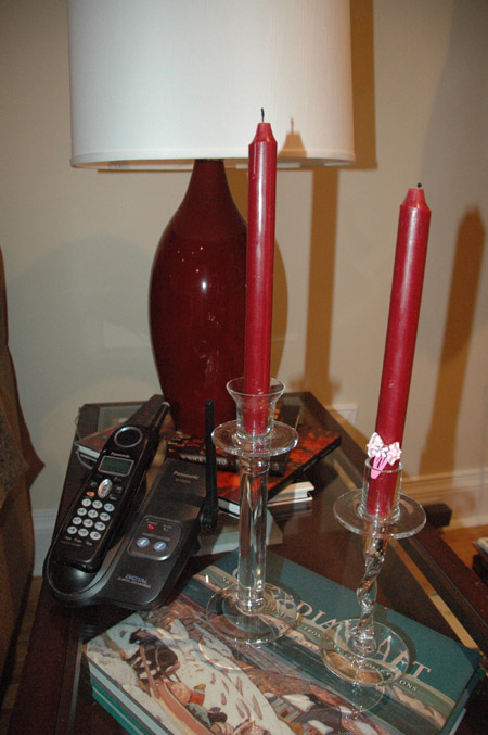
Here is the coffee table. It’s glass-topped. Stacks of magazines were replaced with some art books. The lamp is new. I really like it, and more importantly it casts a really nice light. We changed the bulb for one that provides three levels of light: bright, brighter and brightest. The base of the lamp is glass, and as it’s not very bottom-heavy I secretly fear that it’s going to get knocked over. It’s perched on a couple books to raise its height. Note the artistic decoration of the candlesticks in the photo below. You can blame Emma for that one.
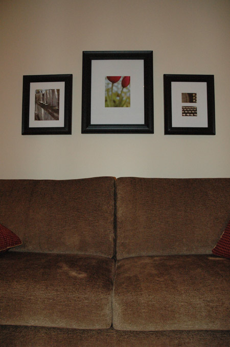
Here’s a shot of our reupholstered couch. It has much better back support and doesn’t swallow hapless passersby anymore. The photos above it are my own, printed on my home computer/printer on glossy photo paper. The typewriter that was used in the two smaller photos is the one that is sitting on the bookshelf. The tulip shot was taken in the backyard. (Special limited time offer! I’ll email you a high-resolution version of the tulip photo, for free, just for being you. You can print it out and hang it in your own living room! All you need to do is leave a comment and let me know if you’re keen!)
This is our revised mantle.
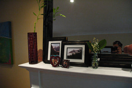
I had my doubts about that huge mirror. In fact, they practically had to twist my arm (it didn’t hurt) but I am very glad they did. I like the effect, and I think it really opens up the room. The red vase was my own purchase. It is glass, and it was on sale at Blueprint for something crazy like $25.00.
The designers originally filled it with pussy willow, but I changed it to the bamboo. Why? Because I grew up in a household that had a jug of cat-tails that was probably older than I was. And I hated them. I don’t have a great fondness for dried flora, although I do acknowledge that some might look nice when well-arranged. But I like my bamboo. Bamboo, for the uninitiated, is super-cheap (available at Loblaws!), and doesn’t need anything except for water. It doesn’t even need soil. It is super-low maintenance.
Mark doesn’t like it, because it’s not as full as the pussy willow. And maybe he’s right about that, but I like having a live plant in there and the splash of green it provides.
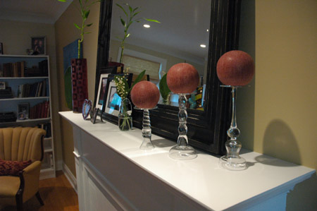
Here’s another view. Note the candle holders. They’re upside down! They’re intended to hold tapers, but apparently putting them upside down is The Hottest Trend in home candle fashions. It is so hot that no one knows about it. Yet. If you put them upside down they make great little platforms for the candle-balls. What do you think?
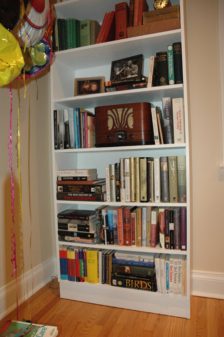
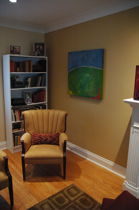
This is the other corner of the room. It looks a lot larger now that two of the extra bookcases have been removed. Where did they go? Great question. They’re in the basement, along with 10,000 of our extra books. sigh
We hung our new painting in that side of the room. The designers and I fussed over its placement, and whether or not it should even go in this room. But I love it. It’s by a local artist named Kathrin von Dehn. I love it, did I say that already? I think it provides much-needed colour to the room… otherwise I would feel overwhelmed by the coordinated designerness of it all, like I was trapped in monochrome. There is otherwise very little in the room that isn’t cranberry or a shade of tan. The painting adds a freshness to the room that wasn’t there before, and it adds some of “us” into it too.
The pillow there, it’s nibbly!
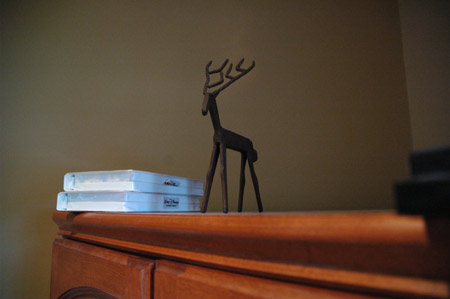
We put this little guy back on the TV cabinet. He looks over the room.
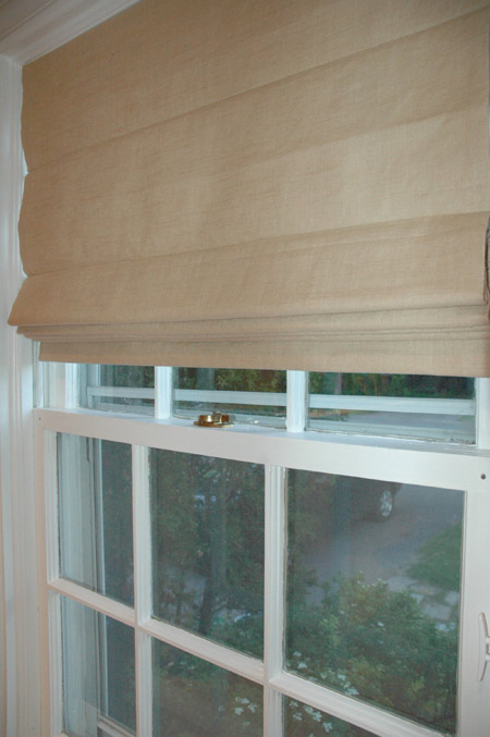
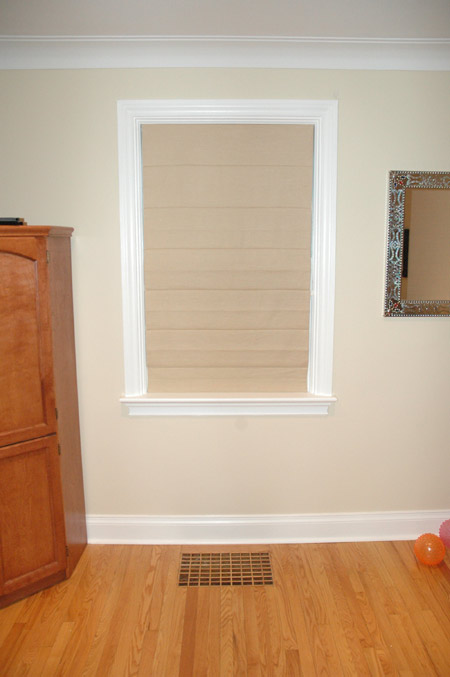
And here are the roman shades that were custom made for our two windows. I really like having these very simple window treatments.
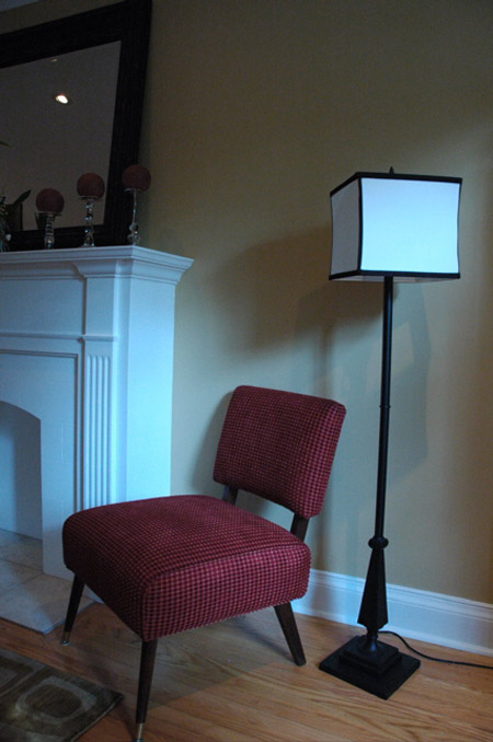
Here’s the hostess chair I bought for $19.99 at SallyAnn. It was originally covered in scratchy brown fabric. I love what they did to it. I can hardly sit on it without squeaks of joy… and I really dig the lamp they paired it with. It’s all in the shade.
There’s so much more that I haven’t mentioned: the floors, the painting, the electrical work, the wonderful fabrics, the rug, the tile… I’d be sitting here all night if I had to provide commentary for each little detail. If you made it down this far you should be congratulated. Me, I’m just glad it’s all over.
Thanks again for everyone who contributed to this little big project!